I’ve worked with many law firms over the years now to design management information systems that work for employees in all departments. Naturally, the reporting and information requirements for the finance team differ markedly from those of the fee earners, and of the senior management team.
Good management information should not just give data, but should provide useful insight that is easily accessed and understandable, and that highlights what action needs to be taken as a result.
While finance teams may be happy dealing with numerical data, statistics, tables and charts, fee earners (I find) are often turned off by this kind of presentation, and are much happier when management information is explained in visual form. Dare I say it, sometimes, lawyers struggle with numbers.
It is often the finance team that develops reporting systems for a law firm, so many systems are numerical data-heavy. But law firm profits rely on individual fee earners maximising their financial performance, so it is vital that management information systems cater to them too. This means that information should be presented in a way that allows lawyers to quickly and easily understand their caseload and performance (and explains what action they need to take).
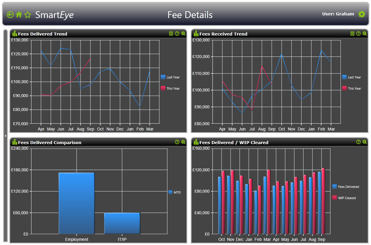
So it is common sense that detailed numerical reports are going to be less easy to comprehend for less numerate people than simple visual displays illustrating the same information. Pictured below: visual displays for fee data in our Katchr management information software.
But there is also science behind this. Detailed reports, with their rows and columns of data, interact primarily with our verbal system. We read tables. When we have tables in front of us, we scan across rows, down columns, and compare values.
Graphs, on the other hand, interact with our visual system. It’s a high bandwidth information flow from what our eyes see to the comprehension in our brain, which can be extremely powerful when done well. Graphs can present an immense amount of data quickly and in an easy-to-consume fashion.
More detailed information about storytelling with data here.
Data visualization is an area of much research and some really interesting theories for data geeks like myself. Authors such as Stephen Few and Edward Tufte have produced fascinating works based on rapid developments of our understanding of how the brain takes in and processes information.
However, for many people it remains a simple matter of common sense that “a picture paints a thousand words” and in my view, a picture also replaces a thousand numbers!

Our Katchr management information system (home screen pictured above) is based on modern data visualisation theory and techniques. It has been developed in consultation with law firms and has, over time, been finely tuned to meet the requirements of all areas of law firm management.
You might also be interested in:
- Creating the best law firm MIS (Part One): Why most law practice management systems set law firms up to fail
- Creating the best law firm MIS (Part Two): How to build an effective management information system
How does your law firm reporting system present management information?
Please tweet your thoughts to me at @KatchrData

If you’d like to find out more about how to build an MI system that caters for everyone at your firm, please contact us by email or call 03333 010 766.
Blog post by Graham Moore, Managing Director, Katchr.